 hero.webp)
Branding
AgriSIMA
SCROLL
The Brief
As part of its transformation, SIMA became AgriSIMA to embody a renewed vision of agriculture. The objective: to create a brand capable of supporting an international trade show dedicated to agricultural equipment, in line with the sector’s ongoing evolution.
The Solution
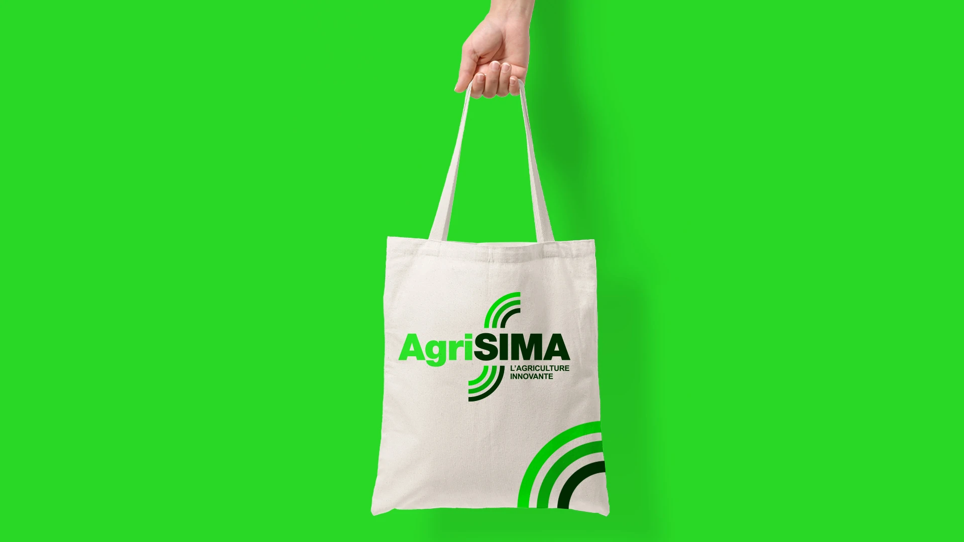
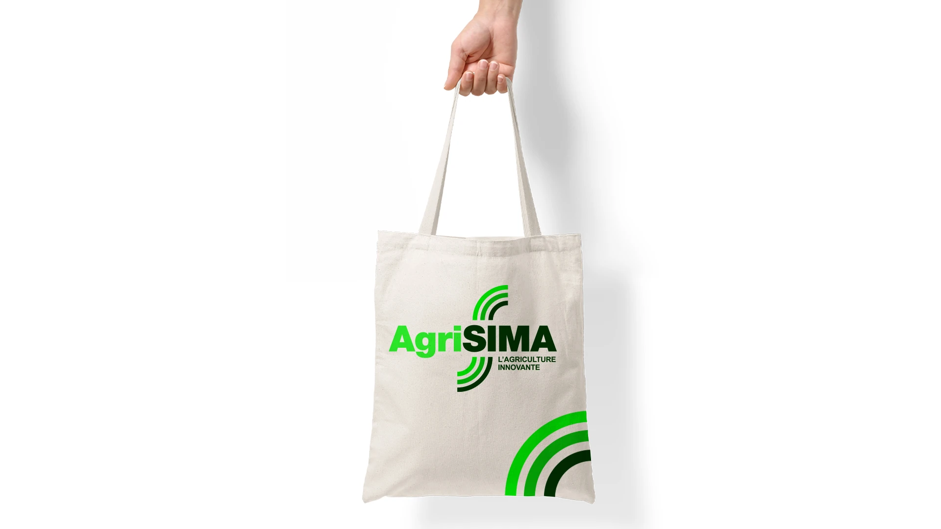
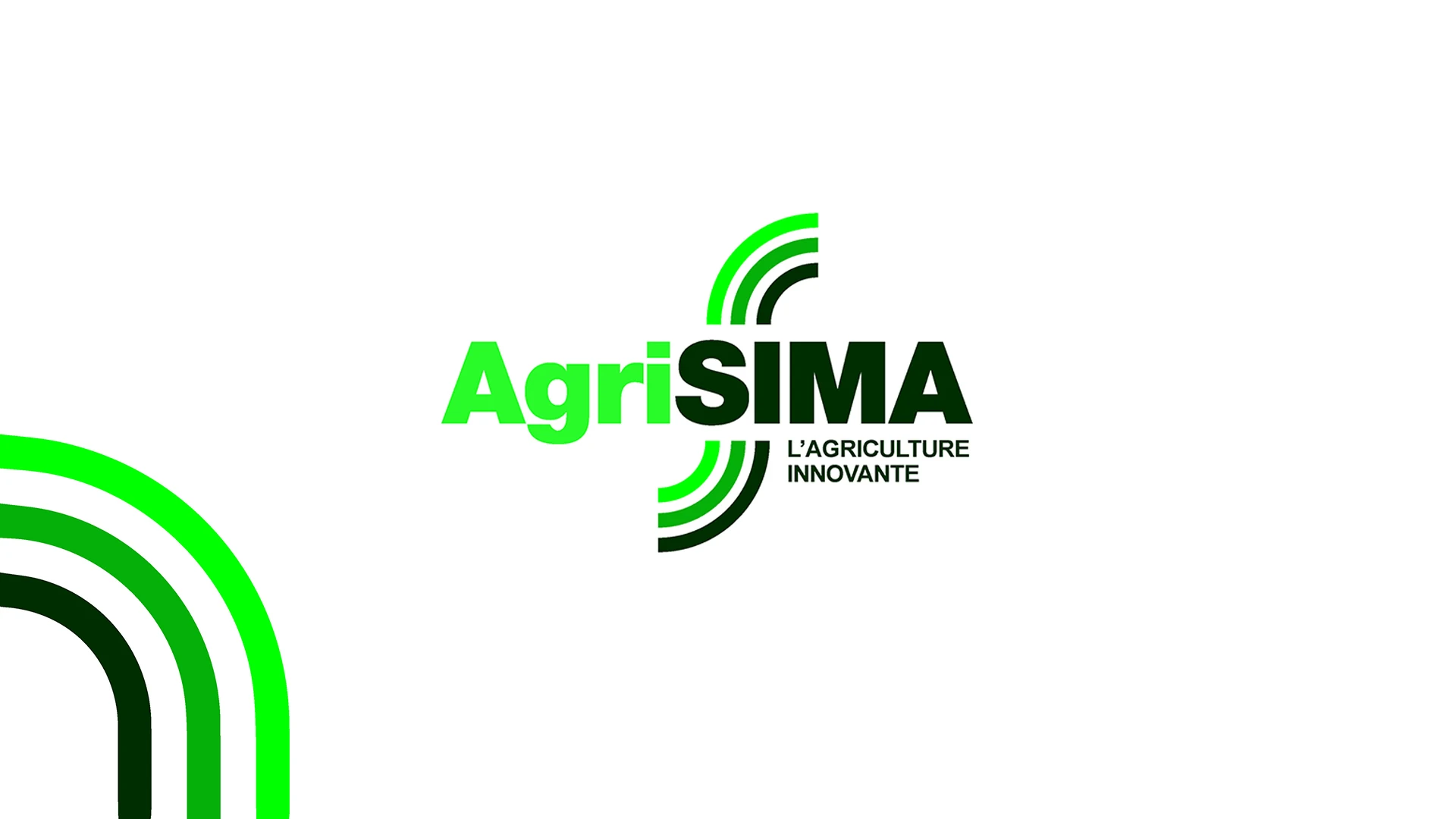
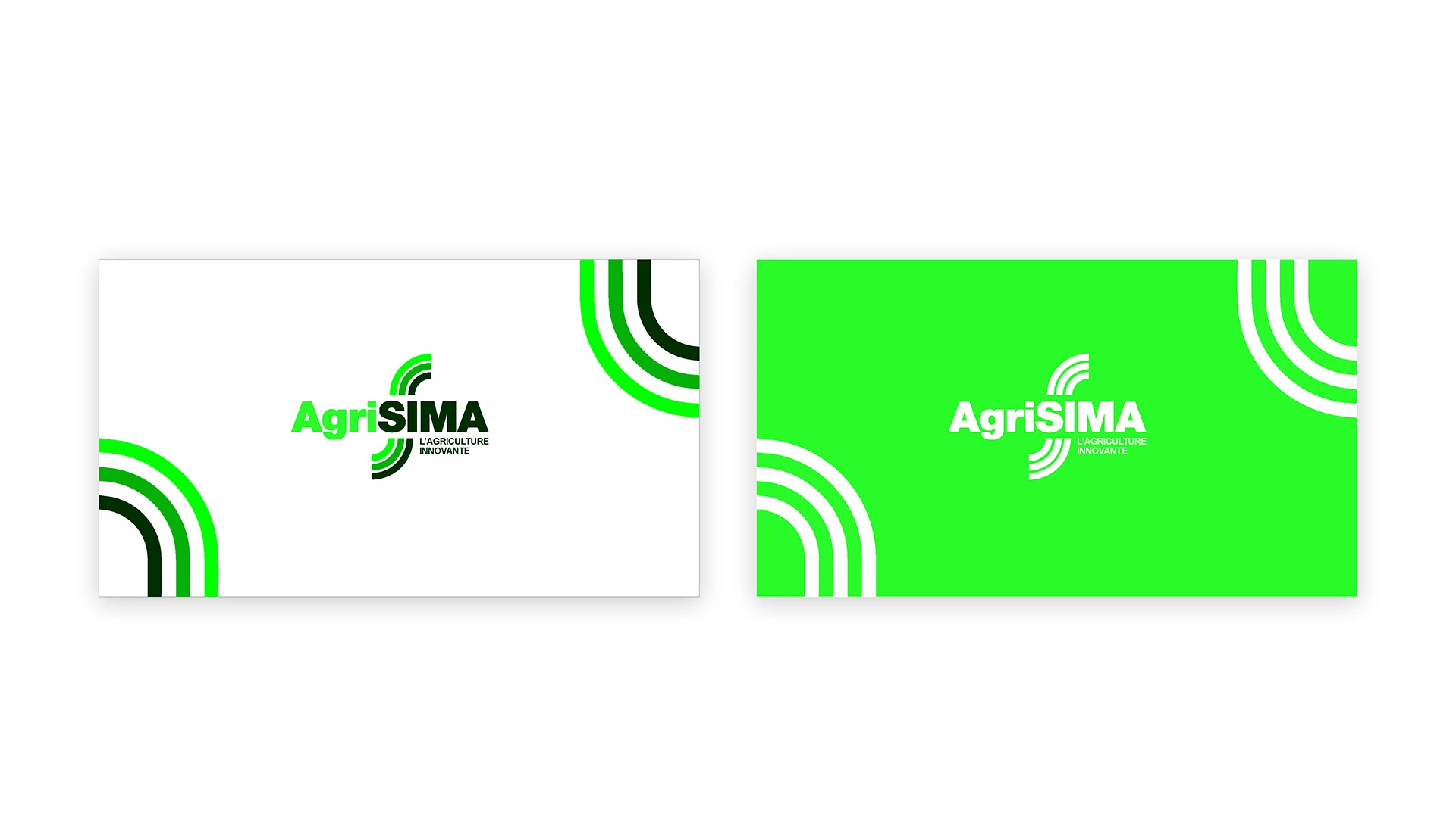
We designed a logotype crossed by dynamic lines evoking ploughing. These lines form the foundation of the visual language, developed to extend across all communication materials and to express movement, transformation, and the energy of the agricultural sector.

Related Case Studies