Branding
EGG
SCROLL
The Brief
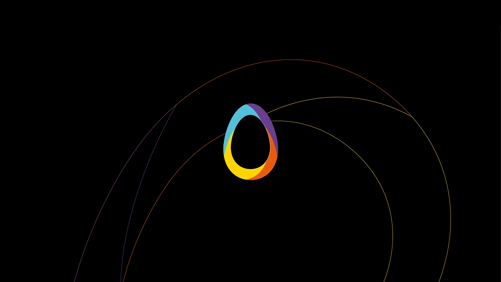
EGG Events launched a pitch we were pleased to win. The project consisted in reinventing the brand’s visual identity across its four countries, while preserving and modernising the egg symbol from its previous logo.
The Solution
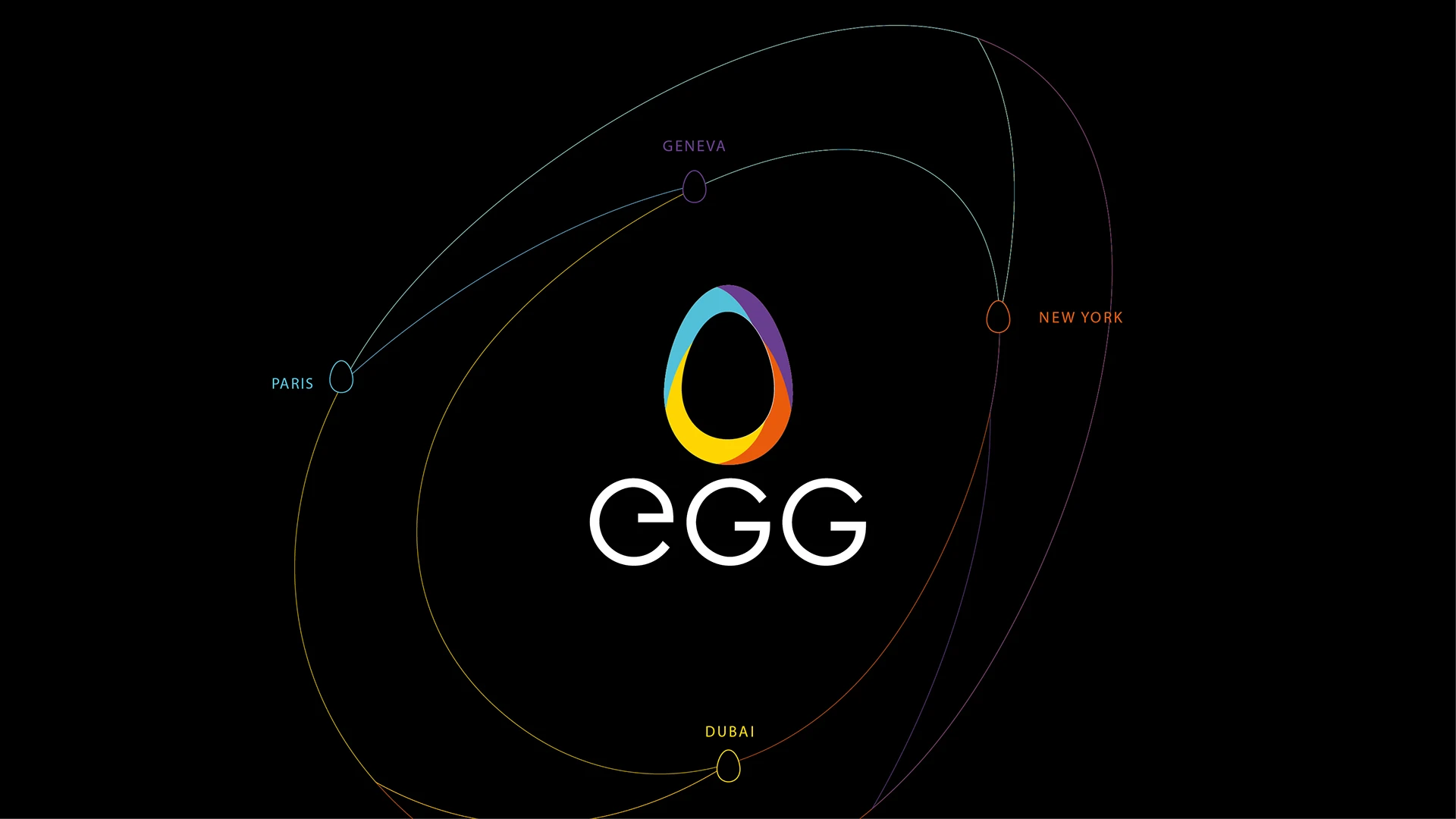
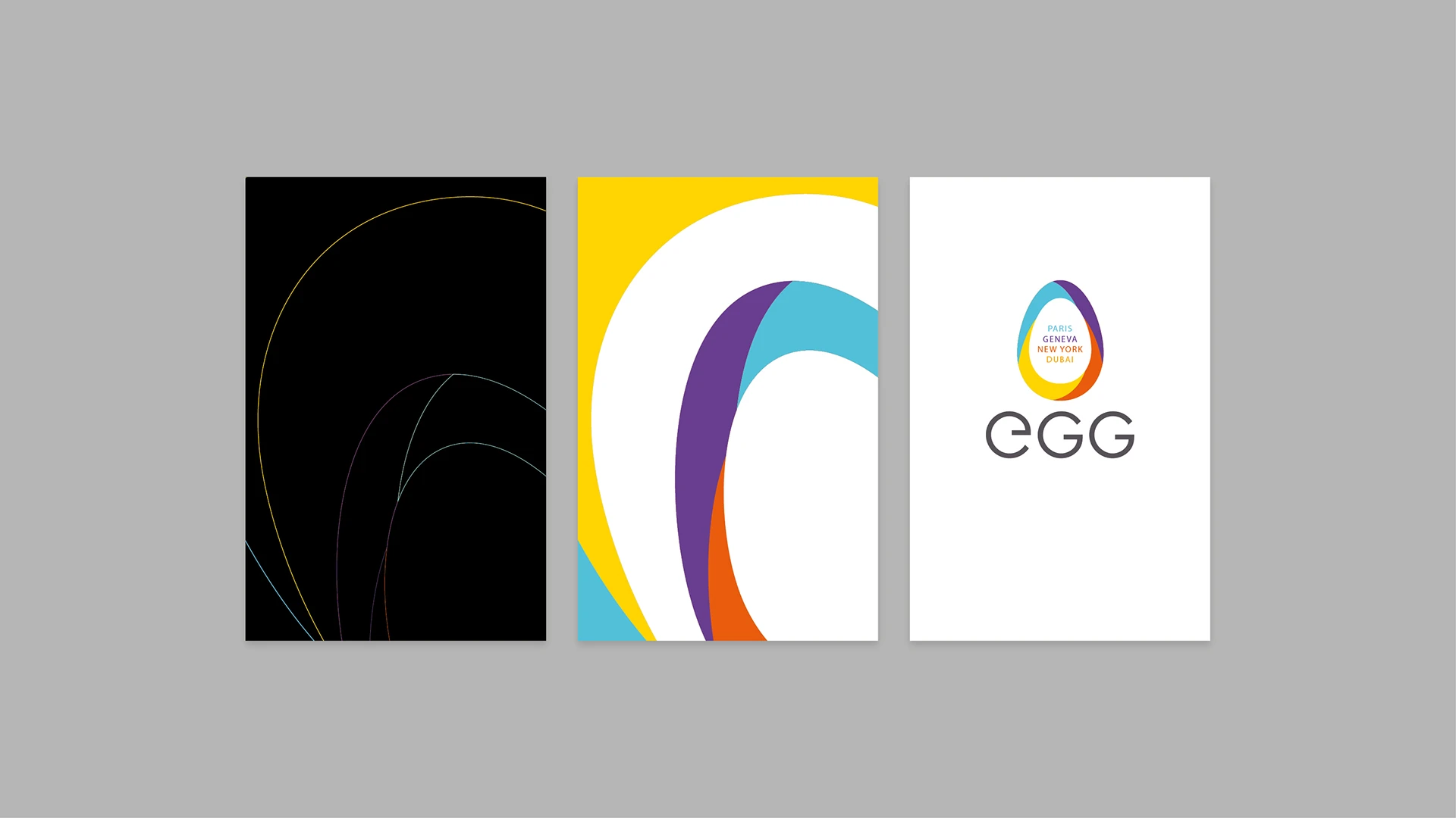
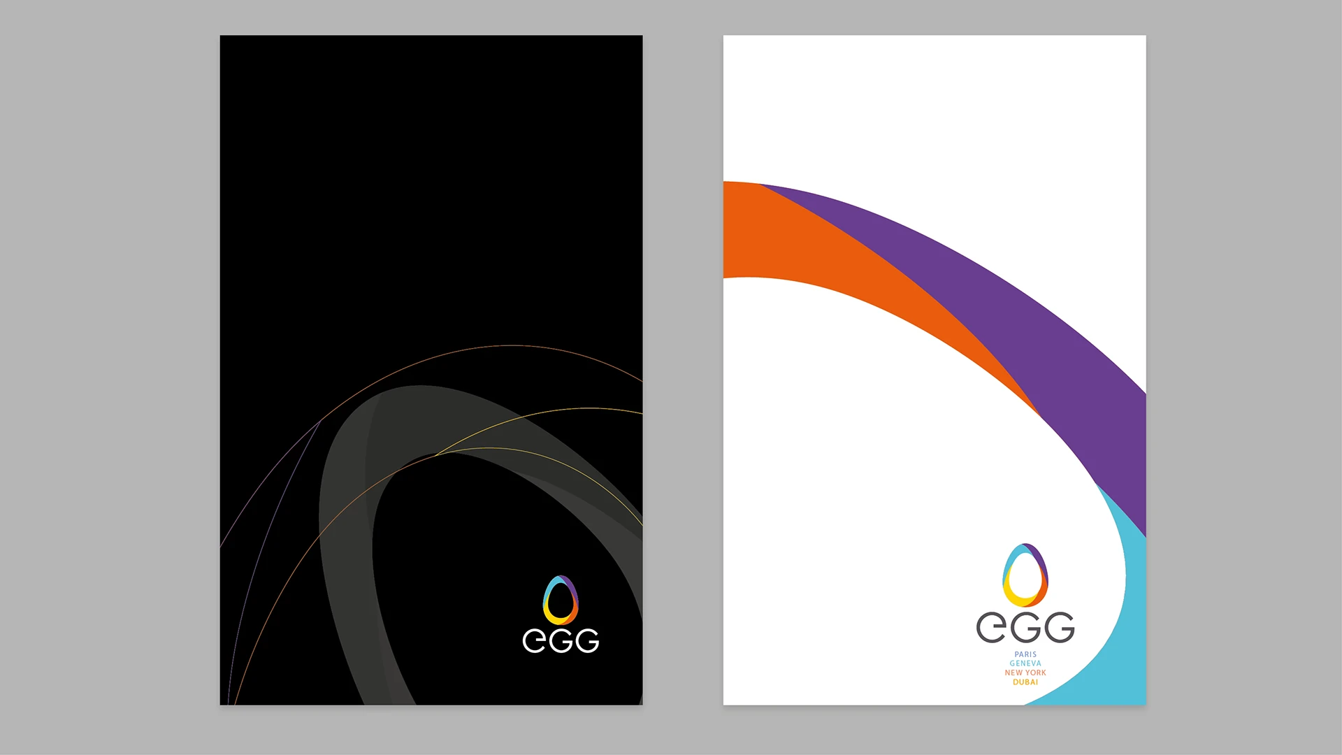
A composite oval. The logo expresses EGG’s qualities: singular, dynamic, creative and international. It is built from four fragments reflecting its diverse talents. Designed for clarity and flexibility, it adapts across all media. Alternative solution: concentric ovals. Four interlocking lines symbolises growth and diversity, each colour representing a different office. The Bodoni typeface adds contrast and warmth.
Related Case Studies